
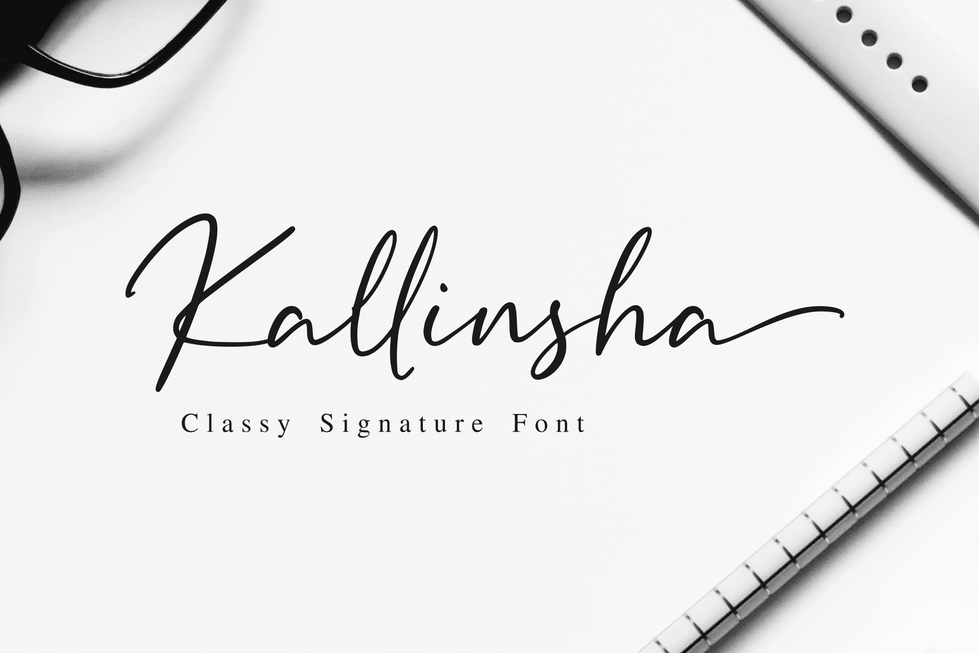
Concept StudyScript
Elegant Social Launch Toolkit
A social-first usage direction where the signature style leads the hero moments while supporting layouts stay structured and legible.
Foundry Showcase
Use these stories to judge hierarchy, brand tone, spacing, and where a font should lead versus where it should support.
A social-first usage direction where the signature style leads the hero moments while supporting layouts stay structured and legible.
A bold headline system for posters and launch graphics where the type needs to read quickly, hold contrast, and stay useful across repeated layouts.
A packaging-led direction showing how a signature style can carry labels, brand marks, and social launch assets without losing readability.
How to use this page
Start with reference. Then move into Type Tester with your own copy before you choose the license or the final brand layout.
Use signature and display fonts for marks, campaign lockups, packaging systems, and launch visuals.
Pair serif and sans directions for articles, menus, product notes, and calm long-form surfaces.
Test scale, spacing, and contrast in Type Tester before building social, landing-page, or paid media layouts.
A useful showcase is not only inspiration. It should help you judge where expressive type leads and where the supporting system has to take over.
After finding a direction here, test the same phrases in Type Tester before you commit to the final license or brand rollout.
Customer Projects
Submit a real project for editorial review. Nothing is published automatically, and customer names, images, or logos are never displayed without recorded permission.